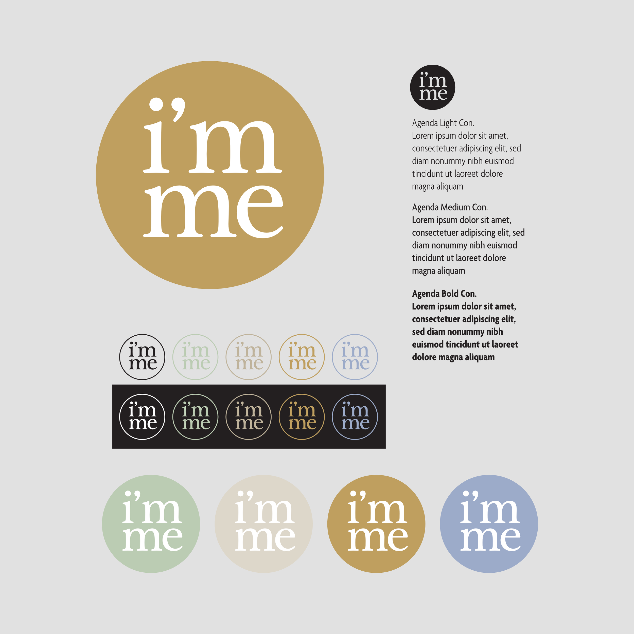
New Logo: I’m me is here
The benefits of a bird’s-eye-view
I’ve been writing my name millions of times. I never realized the connection between Imme, and I’m me - until a brand expert designed a logo for me. It’s been the first time I engaged a branding specialist for my business, and I’d love to share my insights and experiences with you. So, here we go.
WHY DID I DECIDE TO GET A LOGO?
Honestly, it was not even my idea. Sascha, my web designer and partner from our retreat brand, We Come Home, pushed me in this direction. He made contact to Alex from brandnewpixels who had already created our We Come Home logo (which I love!). Although my mind questioned the financial investment, my intuition made me reach out to Alex and kick off the conversation.
HOW WAS THE DESIGN PROCESS?
The process was straightforward. I shared my ideas, values, and key offers, which Alex used to create the first drafts. In the beginning, my mind still questioned the investment - not very satisfied with the first proposals. However, each of the proposals had some tiny parts that I liked. We went through a few rounds with iterative creations. Until I’m me came out. With my (still) skeptical mind, I shared the logo with Sascha. It was his enthusiasm and excitement which, suddenly, also made me see the huge value in it. I’m me, Imme - short, precise, and 100% matching my values and offers.
WHAT MAKES THE LOGO SPECIAL FOR ME?
I have always felt very connected to my given name, Imme. The meaning of I’m me even enforces this connection. It perfectly describes who I am and who I want to be. I am me - in short, I’m me.
Having this logo gives me tremendous thrust to stand up for myself, my values, and my core beliefs. I feel empowered to go my own way - even if this means breaking conventions or social norms. While going through many small and big transitions, “being me” has always been very important to me. My new logo, “I’m me” reminds me it’s not only “okay” to be myself - that’s what I am here for.
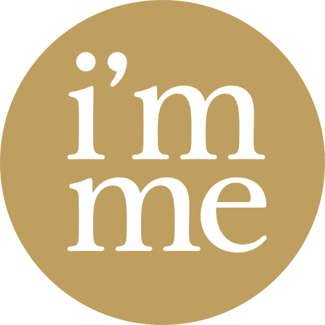
I’m me is located in a circle of golden light. The circle, for me, represents unity and the fusion of the sun & the (full) moon. It’s gold because I love it, and it contains a connection to spiritual energy and higher consciousness.
WHAT DID I LEARN FROM THIS PROCESS?
This process taught me that external support can be precious to find answers already lying within. I’ve been writing my name millions of times - for me; it always was “just” my name. When brand expert Alex developed my logo, he played around with these four letters. With his bird’s eye view and expert knowledge, he could detect another meaning than “just” my name—a discovery I probably would not have made alone.